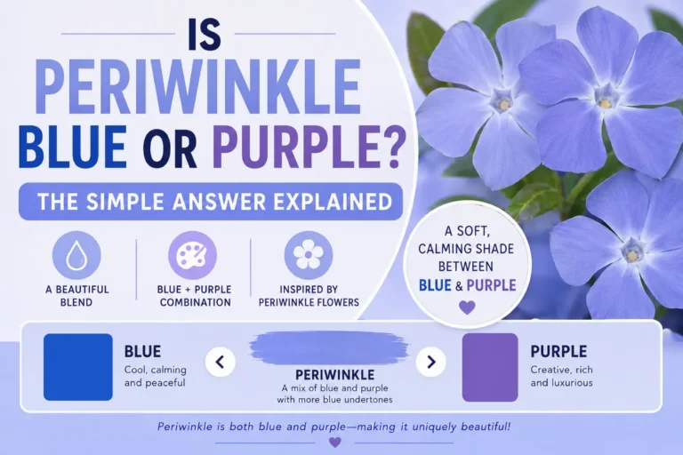
Is periwinkle blue or purple? This is a common question because periwinkle sits between both colors. Many people see it as a soft blue, while others think it looks light purple.
The truth is simple. Periwinkle is a blend of blue and purple. It usually has more blue than purple, but the exact shade can vary.
You may see periwinkle in fashion, home decor, flowers, and digital design. Its calm and gentle appearance makes it a popular color choice.
In this guide, you’ll learn what periwinkle really is, how it compares to blue and purple, where people use it, and why confusion happens. By the end, you’ll know exactly how to describe this unique color.
Quick Summary Box
- Periwinkle is a mix of blue and purple.
- Most people classify it as a light blue-violet color.
- It usually contains more blue than purple.
- The shade can look different under various lighting conditions.
- Periwinkle is named after the periwinkle flower.
- Designers often use it to create a calm and elegant look.
- It belongs to the blue-purple color family.
What Is Periwinkle?
Periwinkle is a soft pastel color that combines blue and purple tones.
It often appears as a pale blue with a slight violet tint. Because it sits between two color families, people disagree about whether it is blue or purple.
Color experts usually place periwinkle in the blue-violet category. This means it contains elements of both colors.
Simple Definition
Periwinkle is a light blue-purple color that blends the calming feel of blue with the creativity of purple.
Is Periwinkle Blue or Purple? The Direct Answer
The direct answer is that periwinkle is both blue and purple.
However, most modern color systems classify it as a blue-violet shade.
If you must choose one color, many designers would say periwinkle is closer to blue. Still, its purple undertones remain clearly visible.
Featured Snippet Answer
Periwinkle is a light blue-violet color. It combines blue and purple, but most shades contain slightly more blue than purple.
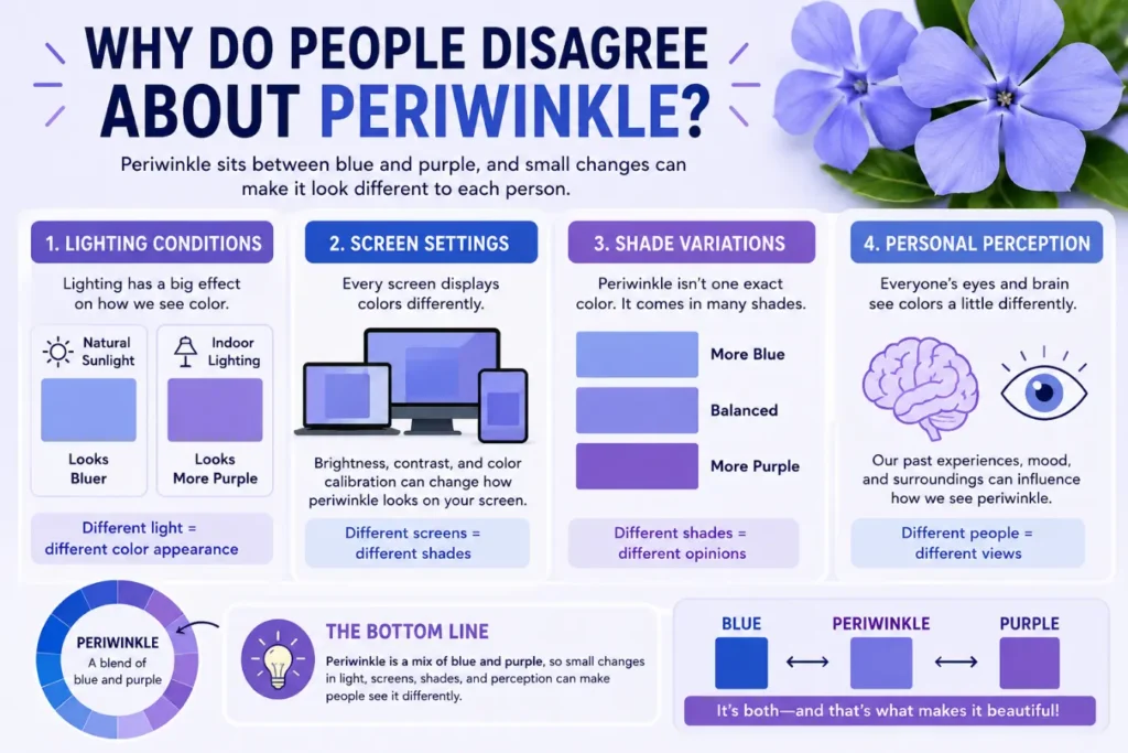
Why Do People Disagree About Periwinkle?
Several factors make periwinkle difficult to classify.
Lighting Conditions
Natural sunlight may make periwinkle appear bluer.
Indoor lighting can make it look more purple.
Screen Settings
Phone and computer displays show colors differently.
One screen may emphasize blue tones while another highlights purple tones.
Shade Variations
Periwinkle does not exist as one exact shade.
Some versions lean heavily toward blue. Others contain stronger purple tones.
Periwinkle vs Blue vs Purple
The easiest way to understand periwinkle is to compare it with blue and purple.
| Feature | Periwinkle | Blue | Purple |
|---|---|---|---|
| Color Family | Blue-violet | Blue family | Purple family |
| Appearance | Soft and pastel | Cool and clear | Rich and vibrant |
| Contains Blue | Yes | Yes | Sometimes |
| Contains Purple | Yes | No | Yes |
| Common Use | Decor and fashion | Branding and design | Luxury and creativity |
| Visual Feel | Calm and elegant | Peaceful and stable | Creative and royal |
Periwinkle acts as a bridge between blue and purple.
What Does Periwinkle Look Like?
Periwinkle looks like a gentle pastel shade.
Imagine a pale blue sky mixed with a touch of lavender. The result is a color that feels soft, fresh, and relaxing.
Many people describe it as:
- Light blue-purple
- Pastel lavender-blue
- Soft violet-blue
- Muted blue-violet
Its delicate appearance makes it popular in modern design.
The Origin of the Periwinkle Color Name
The color takes its name from the periwinkle flower.
These flowers often display beautiful blue-violet petals. Over time, designers adopted the flower’s color as a recognized shade.
Because flowers vary naturally, different versions of periwinkle also exist today.
This contributes to ongoing confusion about whether it is blue or purple.
Real-Life Examples of Periwinkle
You can find periwinkle in many everyday places.
Fashion
- Bridesmaid dresses
- Spring clothing
- Scarves and accessories
- Children’s clothing
Home Decor
- Bedroom walls
- Throw pillows
- Curtains
- Decorative artwork
Nature
- Periwinkle flowers
- Some butterfly wings
- Certain gemstones
Digital Design
- Website backgrounds
- App interfaces
- Social media graphics
Its soft appearance works well in both modern and classic designs.
Common Mistakes People Make About Periwinkle
Many people misunderstand this color.
Mistake 1: Calling It Pure Blue
Periwinkle contains purple tones.
Pure blue lacks these violet undertones.
Mistake 2: Calling It Pure Purple
Most periwinkle shades contain significant blue influence.
This makes them different from traditional purple.
Mistake 3: Assuming All Periwinkle Shades Match
Different brands create different versions of periwinkle.
Some appear much bluer than others.
Mistake 4: Ignoring Lighting
Lighting dramatically changes how periwinkle appears.
Always check the color under different conditions.
How Designers Classify Periwinkle
Professional designers often place periwinkle within the blue-violet spectrum.
Color theory positions it between blue and purple on the color wheel.
Designers appreciate this balance because it combines:
- Blue’s calming effect
- Purple’s creative energy
This unique combination creates a versatile color that works across many industries.
Tips for Identifying Periwinkle
If you are unsure whether a color is periwinkle, use these simple checks.
Look for Violet Undertones
A true periwinkle shade shows hints of purple.
Check the Brightness
Periwinkle is usually light and pastel.
Compare It with Pure Blue
Place it next to a standard blue.
If you notice purple hints, it may be periwinkle.
Compare It with Lavender
Periwinkle generally looks bluer than lavender.
These comparisons help identify the color more accurately.
Periwinkle in Daily Life
Periwinkle appears more often than many people realize.
Weddings
Many wedding themes use periwinkle because it feels elegant and romantic.
Branding
Companies use it to create a friendly and calming image.
Interior Design
Homeowners choose it for relaxing spaces.
Art and Crafts
Artists often use periwinkle to add softness and depth.
Its versatility makes it useful across many settings.
Synonyms and Related Color Terms
People often search for periwinkle using similar color names.
Synonyms
- Blue-violet
- Lavender blue
- Pale violet blue
- Soft purple-blue
- Pastel blue-purple
Related Colors
- Lavender
- Lilac
- Cornflower blue
- Powder blue
- Wisteria
- Violet
- Indigo
These terms help describe colors that share characteristics with periwinkle.
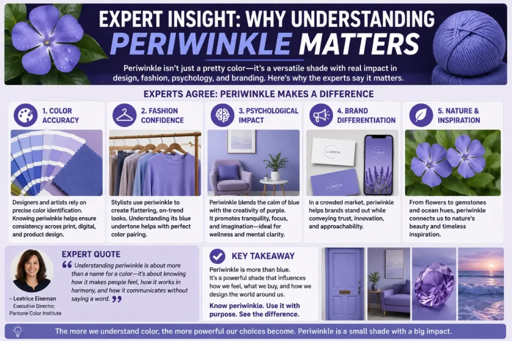
Expert Insight: Why Understanding Periwinkle Matters
Color influences perception and emotion.
Periwinkle stands out because it combines the best qualities of blue and purple.
Blue often represents trust, calmness, and stability.
Purple often symbolizes creativity, imagination, and elegance.
Periwinkle brings these qualities together in a balanced way.
Design professionals use this color when they want a space or product to feel welcoming, peaceful, and sophisticated.
Understanding the difference between periwinkle, blue, and purple helps create more accurate design choices.
Frequently Asked Questions
Is periwinkle more blue or purple?
Most periwinkle shades are slightly more blue than purple.
Is periwinkle considered a pastel color?
Yes. Periwinkle is usually classified as a pastel shade.
What color family does periwinkle belong to?
It belongs to the blue-violet color family.
Is lavender the same as periwinkle?
No. Lavender generally contains more purple, while periwinkle contains more blue.
Why does periwinkle look different on screens?
Screen settings and color calibration affect how colors appear.
What colors go well with periwinkle?
White, gray, silver, navy, blush pink, and soft green pair well with periwinkle.
Is periwinkle a warm or cool color?
Periwinkle is generally considered a cool color.
Can periwinkle be used in professional design?
Yes. Many designers use it for branding, interiors, and digital products.
Internal Linking Suggestions
Consider linking this article to:
- Types of Blue Colors
- Purple Color Meaning
- Pastel Color Guide
- Color Theory Basics
- Best Colors for Home Decor
- Understanding Color Psychology
Conclusion
So, is periwinkle blue or purple? The most accurate answer is that it is both. Periwinkle is a beautiful blue-violet shade that combines elements of blue and purple into one soft, elegant color.
Most versions lean slightly toward blue, which is why many designers classify it as a blue-violet color. However, the purple undertones remain an important part of its identity.
Whether you see it in flowers, clothing, home decor, or digital design, periwinkle offers a calm and balanced appearance. Understanding its unique position between blue and purple helps you identify and use the color more confidently. The next time someone asks if periwinkle is blue or purple, you can confidently explain that it belongs to both worlds.